603-733-7249

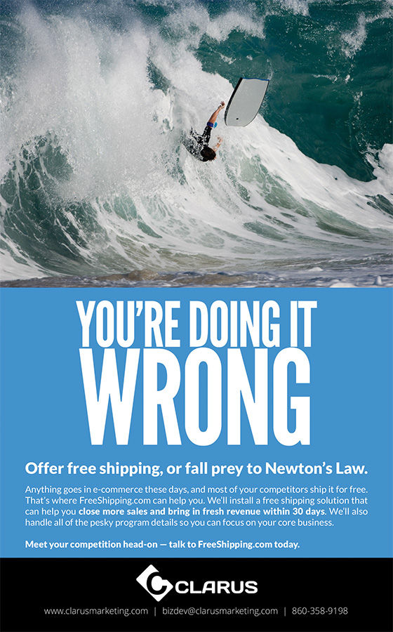
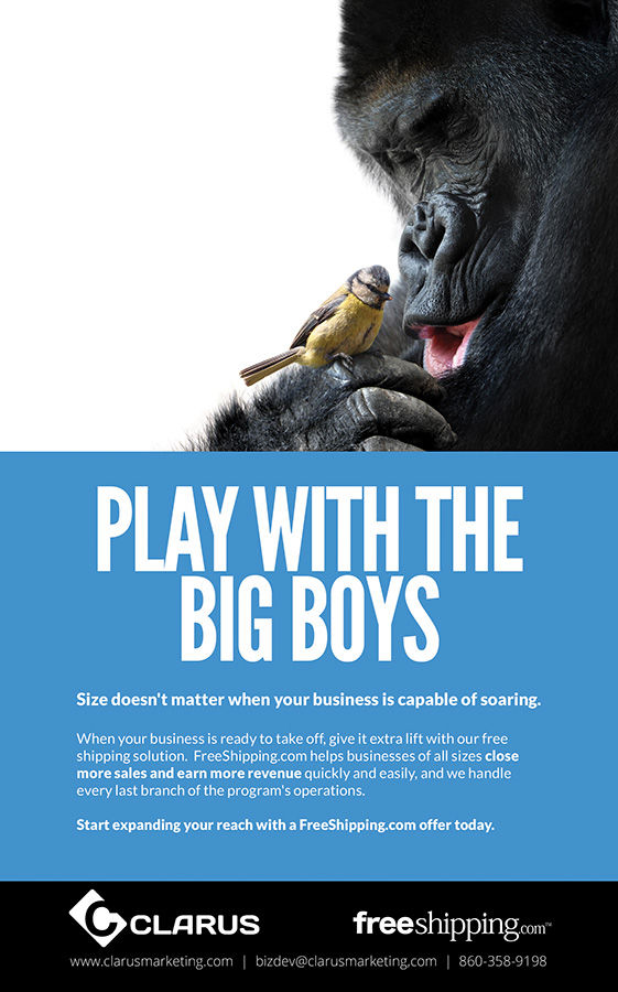
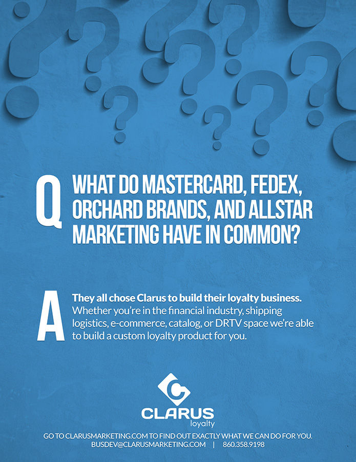
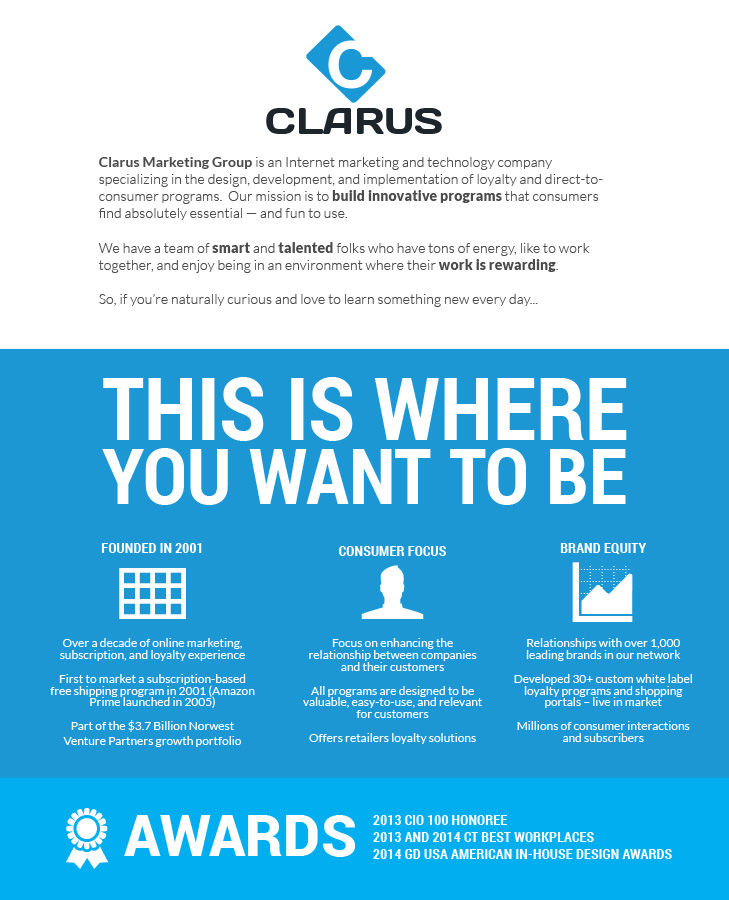
Upon my entrance to the company as Creative Director, I was tasked with not only building a creative department, but was trusted to begin work on a complete rebrand of the company. This included designing a brand new logo, redesigning the website from the ground up, and resetting all associated print and digital assets. The examples below begin to scratch the surface of the work that was completed.

THE WEBSITE

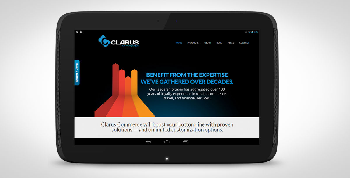
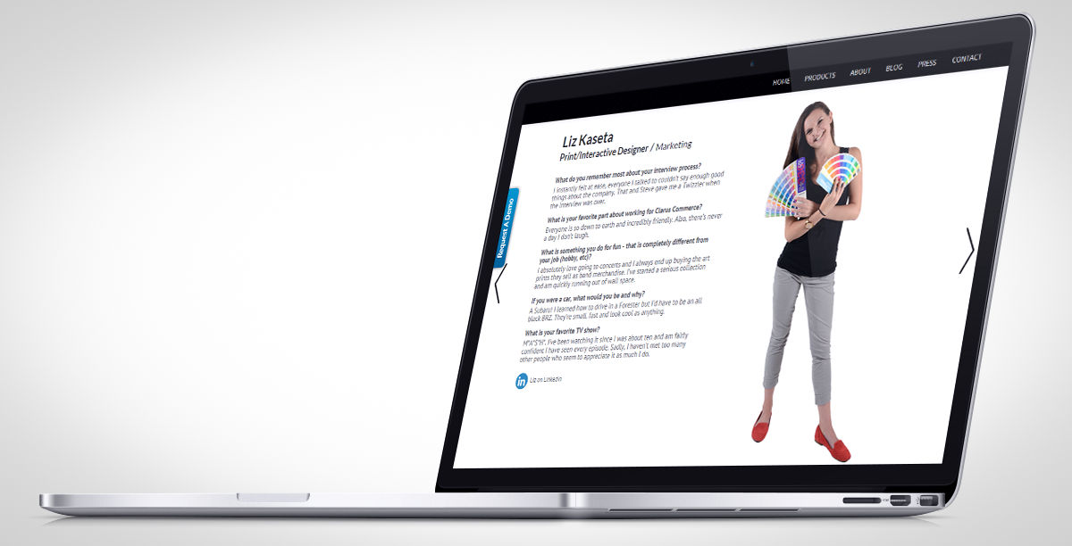
I was determined to use the WordPress platform for the new Clarus site, as it would ensure that there would be the ability for multiple users to be able to administrate parts of the site. PR, Social, Blogging, Creative, and the like were able to log in, and add content. Starting with a solid theme foundation, we immediately started mocking up all of the aspects that we needed changing. What exists today is a fresh and fast site that has been in service for the last 3 years.

320 + Up Responsive

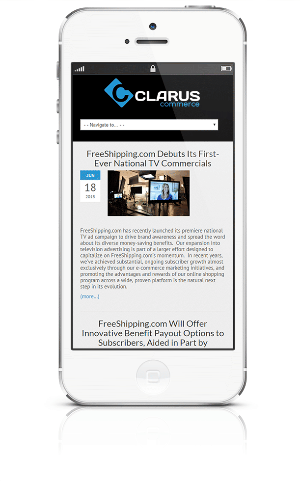
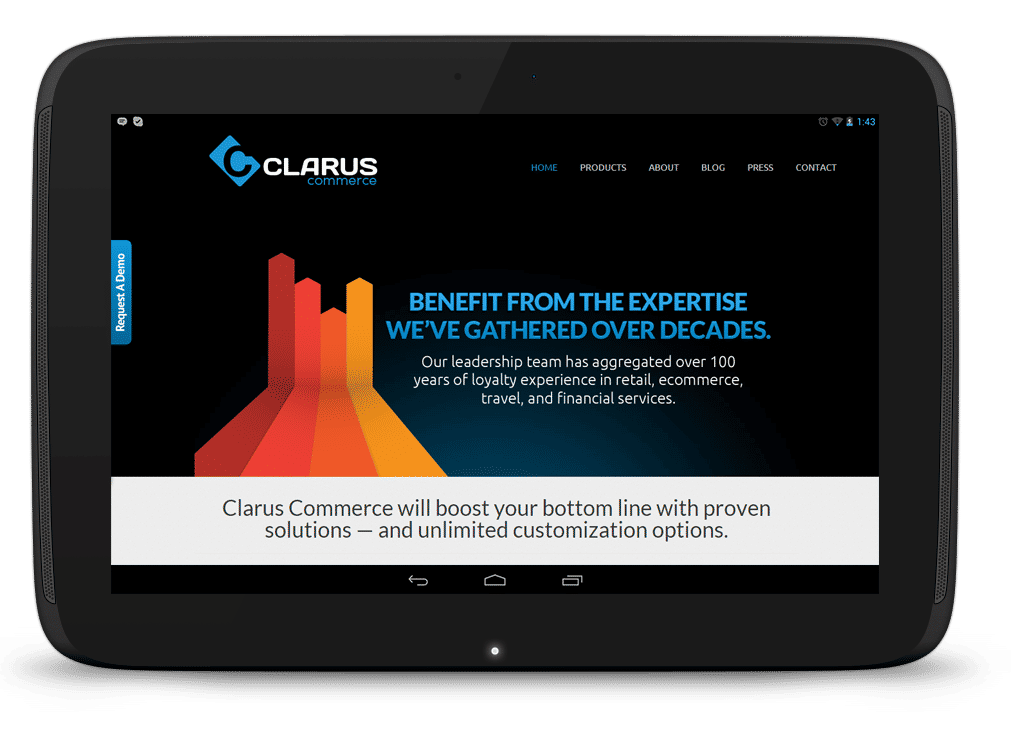
It was important to ensure that the site was responsive… we tweaked and tested, and mocked up and rearranged a number of variants in our wireframes to make sure that we were able to have a clean user experience regardless of what device the user was visiting the site with. With some magic tweaking to address some of the failure points that the original parent theme had, we were off and running.  

Print and Advertising

A smattering of some of the ads that were worked on to promote Clarus, internally, and externally. Much of the strength of the Clarus brand was the use of the “Clarus Blue”, which was universally adapted at the organization as the primary brand color.

clarus-logoThe Logo

The Clarus Logo  was designed to be the embodiment of what Clarus is… a high-end commerce company that creates great products that strengthen their client’s business, build brand loyalty, and fosters long-term, profitable relationships. My final concept build (after lots of sketching, reviews, critiques, meetings, and workshopping), was the concept of a forward-moving card (be it a membership card, credit card, etc.). We swipe cards every day. The life blood of Clarus revolves around subscription and loyalty, something deeply associated with the concept of a card. Globally common terms like “I’m a card carrying member…” resonated deeply when I was deep in the process. The card design is simple, straightforward, and specifically geared to communicate what we wanted. The tilt of the card was designed to further illustrate motion. The “C” cut out of the card denoted that Clarus has an indelible place in the concept of membership and loyalty in the space. The use of blue, with it’s inherent psychological traits (loyalty, trust and integrity, reliability and responsibility), was a very important aspect to include in the final versions.