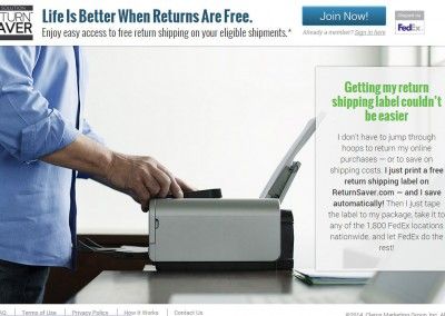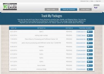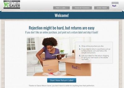
A very simple, very smart product. For a small annual fee, Return Saver allows members to return virtually any purchase made online for free (some restrictions apply, but it’s a pretty generous product).
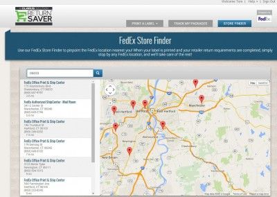
Return Saver is a fully responsive site, incorporating FedEx APIs, and a clean, straightforward design. It’s designed to be easy to use, and it really is. This one was a pleasure to build out with my team, and we’re really stoked on the final product.
The Website Build….
Strangely enough, the design of Return Saver was not an easy one, even with it being such an simple product. I wanted Return Saver to be simple, easy to navigate, and employ a full responsive design that didn’t fall flat if someone wanted to use their mobile device to navigate the site while they were in a cafe, in a parking lot, or at home on a tablet.
The initial build started with a deep consideration of mobile first design methodology, but… backwards, due to a relatively intense deadline. Working with our frontend developer, we tag-teamed the site. As I designed the initial layouts (with responsive in the front of my mind), she was on point; ensuring that we had frontend and backend completely covered with our intentions for the site. We specifically designed the process around the Return Saver project to be tight, clean, and completely transparent. If we had issues, they were able to be squashed quickly prior to any sprint.
We worked directly with FedEx’s branding review team to ensure that every single screen, mock, comp, and copy block was meeting their strict standards.
The Return Saver site was a pleasure to build, with an incredible team of players, in a very tight timeline.
The Infographic
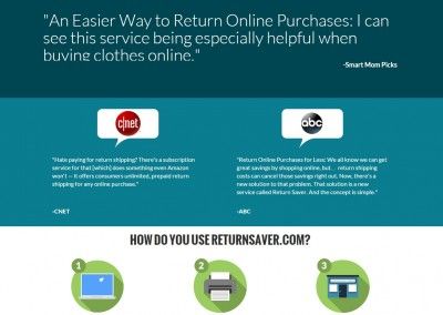
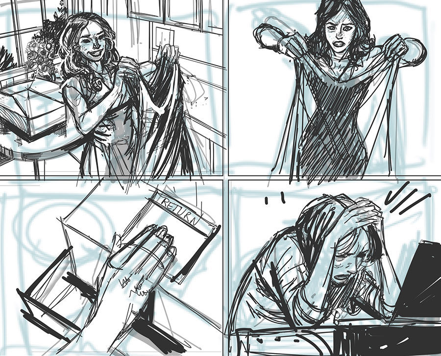
In an effort to further the reach and explanation of the product, I was tasked with building a high-powered infographic; a visual representation why the Return Saver product makes sense for the average consumer. I decided to pull in my friend Steve Ellis, an award-winning illustrator, to add to the punch. With a few false starts, I collaborated with the product manager, and built a storyboard, which then evolved into a number of solid layouts. We settled on a very colorful and impactful version that I designed without the standard “infographic” elements.
WINNER!
GDUSA 2015 American Inhouse Design Award

The Video
With a unique product in a common space, it’s important to be able to explain the features and benefits, and more importantly- how it’s used… in a very straightforward fashion. With time not necessarily on our side, I needed to find a way to build out a video that explained Return Saver in a very simple way. Quick thinking determined that a compelling combination of a clean aesthetic, some tight screencaps, and understandable, simple copy could work wonders.
This was a relatively quick build, and one that I had to do singlehandedly… everyone was quite happy with the results. You gotta love Adobe AfterEffects and Premiere.
Credit where credit is due:
Creative/Art Director, Lead Designer – Stephen Rovetti
Designers – Liz Kaseta, Caitlin Everin
Frontend Development – Ortal Gefen
Product Manager – Jennifer Fish
Infographic Illustrator – Steve Ellis
