PRIDE Logo
studio m was contacted by members of the Pride BRG (our MassMutual LGBTA Business Resource Group) to develop a new logo for the organization. We were asked to create a fresh, new, and engaging logo that is recognizable, and speaks to the heart and soul of the BRG.
The process of building the logo involved stages, the first being a significant bit of research. We looked at a wide variety of LGBTA organizations, and identified current visual and aesthetic trends. We spent time researching the iconic “rainbow” pride flag; it’s history, it’s meaning, and how we could incorporate it into the logo.
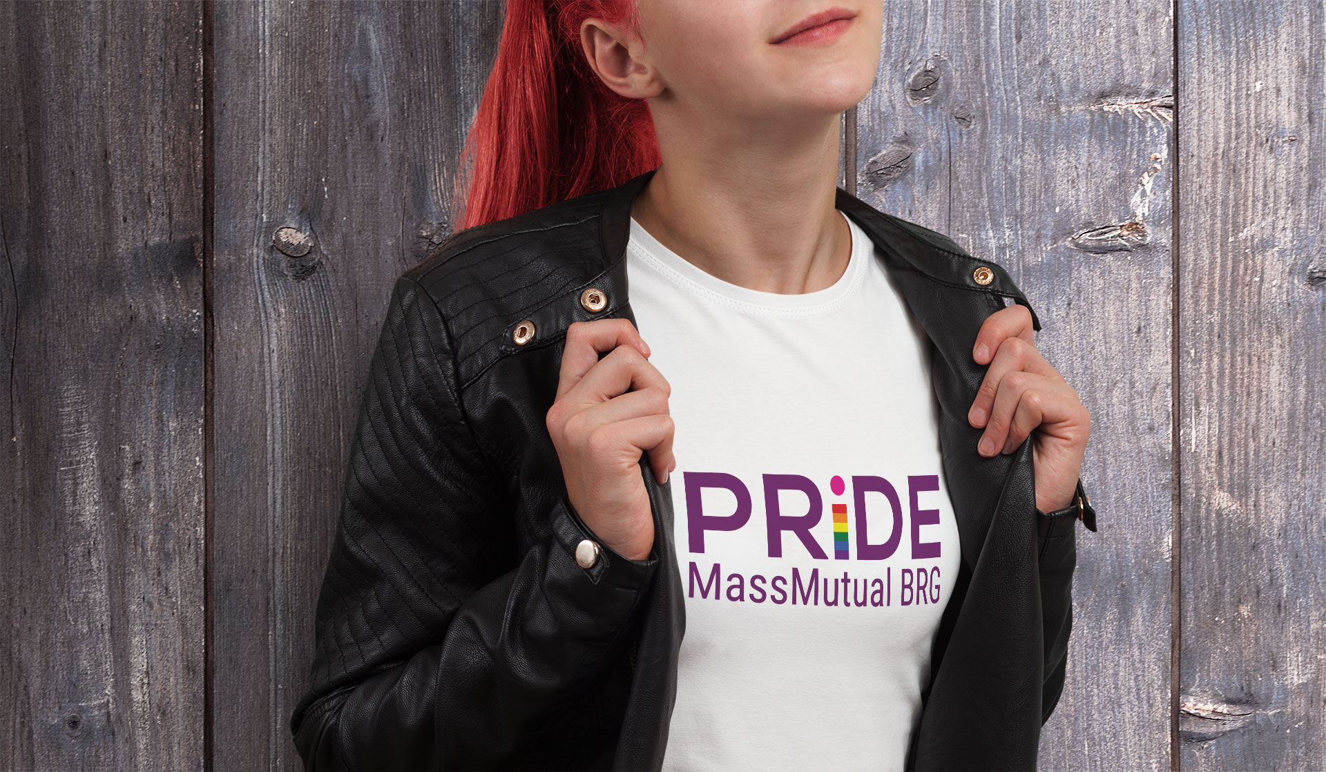
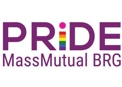
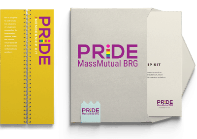
Through research, sketching, and a number of different revisions, we developed the logo represented here. The new Pride BRG logo represents the word “PRIDE” in strong uppercase letters, with the lowercase “i” in the word (designed to represent the unique individual with the PRIDE rainbow colors) included and protected by the rest of the letterform. This design speaks to inclusivity, strength, and diversity and incorporates a strong visual presence, softened by rich purple tones.
The redesign was a great success, and has been accepted with open arms by the PRIDE BRG. They couldn’t be happier, and neither could we.
