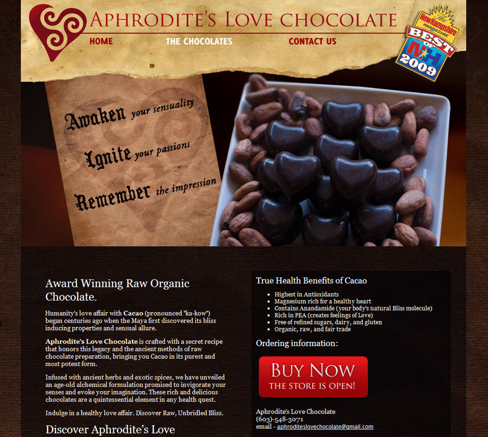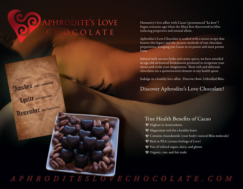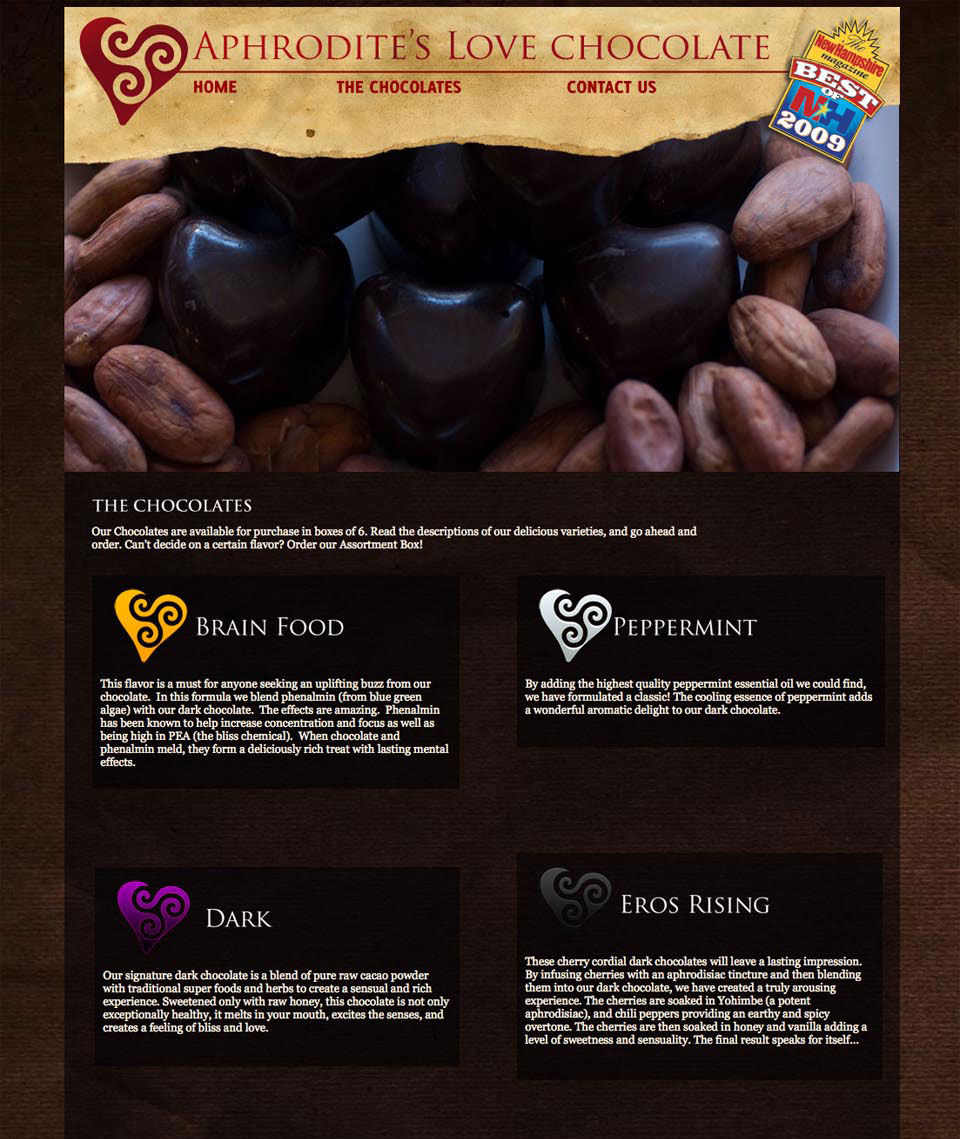
 Aphrodite’s Love Chocolates approached me to develop a complete package for their new brand. After a couple of in-depth marketing “big picture” meetings, we were off and running. We initially developed a number of comps for the Aphrodite’s Love Chocolate logo; it needed to represent love, class, and a visual element representing the celtic triskelion… a symbol of progress, sometimes evolution. After the initial logo development and typeface choices, we went directly into a combined print and web development mode, creating the website and all printed collateral, including package labels, postcards, business cards, brochures, website, and ecommerce store.
Also in the project we optioned two photoshoots; one on location for the product, and one in studio to feature two female models (see half fold thumbnail) to create the immersive, rich, and powerful front and back cover images. Our personalized photography did the trick, as opposed to dealing with stock photo options that would never have cut it.
At the project finish date, Aphrodite’s Love Chocolate had a complete brand online, in print, and on the shelves in specialty markets. Great success. GREAT Chocolates.
