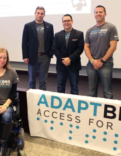
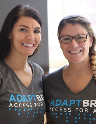
During the time that the MassMutual Employee Resource Groups were being rebranded, the employee disability and inclusion group was also changing its name from EASE to ADAPT. ADAPT needed a new logo and they asked us to get creative.
We were told the logo should “stand out and be intentionally different and innovative.” Specifically, we were asked to choose colors and fonts carefully. People with visual impairment such as color blindness should be taken into consideration. Traditional handicap symbols were to be avoided. Including the tagline in the design was also a requirement.
One of the biggest challenges when you’re designing a logo is when the client tells you that due to specific corporate restrictions, it can’t be anything but a wordmark.
We came up with an interesting idea. Spelling ADAPT in braille under the acronym, the new blue and black logo includes the tagline “Access for All.” The design is readable by people with low vision or colorblindness. The braille creates an added shape element, but we still considered it to be a wordmark.
A super creative design, and one that was a lot of fun to work on.
Design Team: Stephen Rovetti, Marcin Witruszynski
Creative Director: Tripp Fischer

